Awesome 😃!
Looking forward to chatting with you
SOS
A website to help people in mental health crises, families affected by suicide and to fundraise
Project Title:
Complete brand overhaul and new website UI / UX.
Industry:
Charity.
My Role:
User Experience, User Interface, Designer, Web Developer.
Tools Used:
Figma, Adobe Illustrator, Wordpress, Visual Studio Code

DISCOVER
Initial problem
Gathering the brief up
After a successful pitch to win this project I began by interviewing the charity founders on what they were looking to achieve from their new rebrand and new website.
- A bright and colourful theme
- A modern logo they could use in various formats and layouts
- Help turn the website into a resource of information users could engage with
- Help increase volunteering and donation
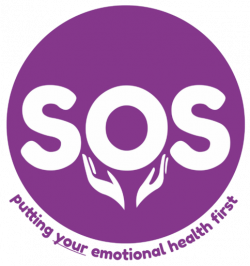
Looking at their current branding and website
They liked the colour of their original (below) logo, but wanted the logo to have a deeper meaning behind it.
Apart from this logo they had no branding to speak of, everything was cobbled together in microsoft word and the logo added on.
Their original website was a free WordPress theme that had grown out of control, they had no ability to edit anything on the website and every time they tried to add new information or pages it would likely break. This meant they couldn’t keep up-to-date with new methods of help or providing information about the running of their charity.
DEFINE
Looking at the problem
What is actually wrong with what they have?
The brand definitely needed a refresh and some guidelines put in place so they had something to work from in the future.
With no real theme or structure to flow you couldn’t tell that any two pieces of collateral were related.
The website had no useful information on what to do in a mental health crisis apart from calling them, but not everyone called.
DEVELOP
Mental health research
How do you reach people who need it?
If I was going to provide a resource of information for people, I needed to start learning about what the common mental health conditions are and map them out, check out all the NHS material I can and then get it rewritten through a medical professional.
I also needed to look at how people get support, that includes learning more about mental conditions and what their coping strategies could be and also looking into support groups for each of these conditions.
I also need to make sure it’s immediately obvious how someone can get help when they need it, I can’t make people navigate even 2 pages deep to get help, it needs to be obvious on every page.
DEVELOP
User flow
Thinking about user flow
Now I have all my common mental health conditions, coping strategies and support groups mapped out I need to think about the user flow to each of those conditions.
The new sitemap
Now I know how the pages should work I can look at the sitemap as a whole.
I also need to take into consideration what the previous sitemap was because creating or changing any url structures will results in 404 pages on google, which is terrible for a mental health charity where speeds is important.
DEVELOP
Create new logo and brand theme
I know how it should work, but how should it feel?
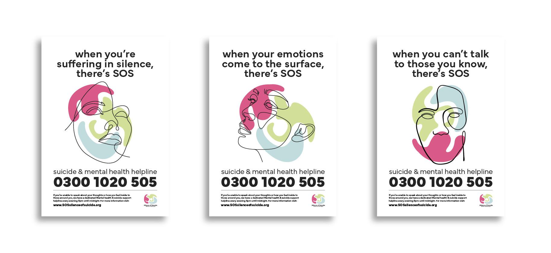
I started off for a few visuals routes on how I could take this brand, I wanted it to address emotion. So my initial ideas were to use form and colour to display the negative emotions we hold inside of us.
Route 1
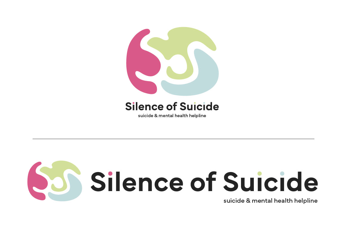
Route 2
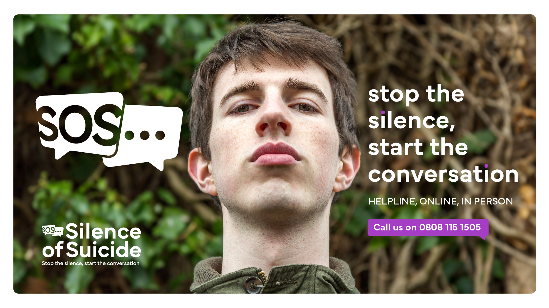
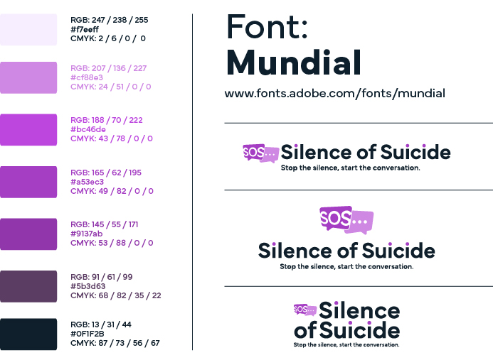
After exploring form and colour I wanted to bring in something that had a deeper meaning. The clue was in the original name, SOS, commonly thought to mean ‘Save our Souls’ in morse code.
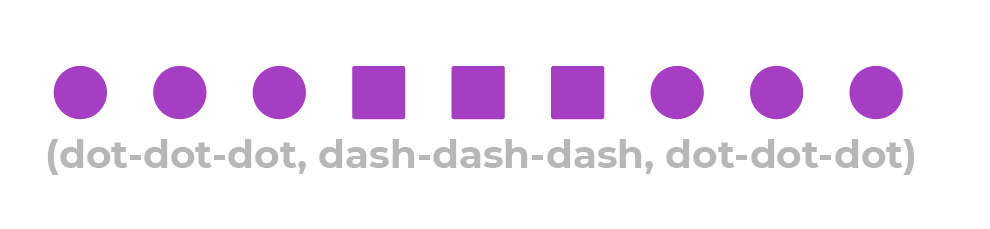
So with this in mind I wanted to see how I could incorporate it into a visual style.
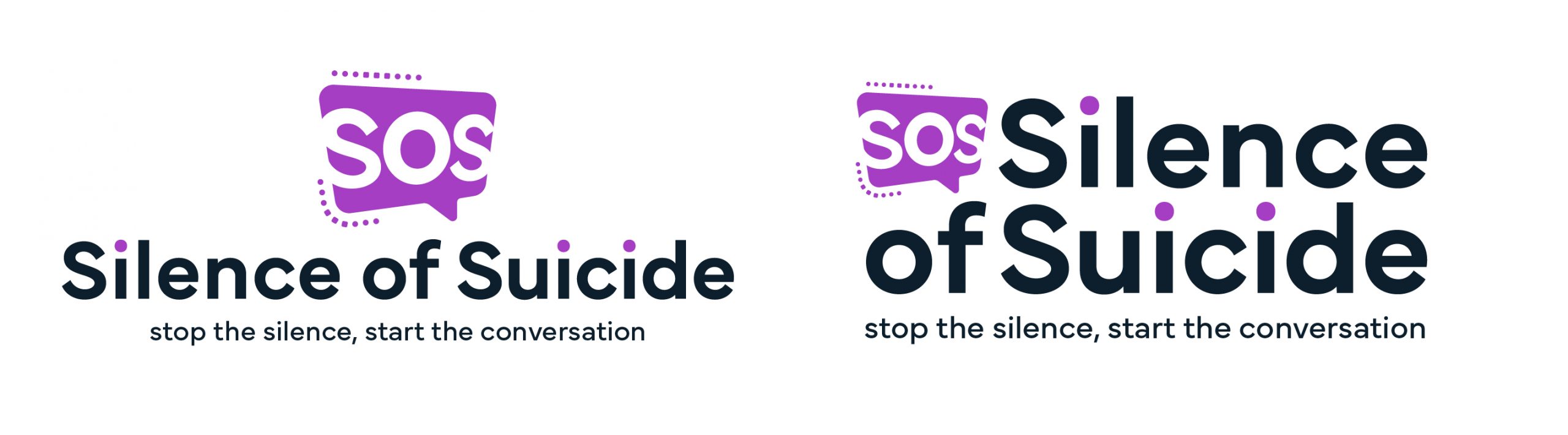
The Final Route
The final logo was a derivative of the second route, but more paired back as they thought the morse code could be lost.
So in the final route I use 3 dots (an ellipsis), as it’s commonly use when people are starting a ‘conversation’ through messages in modern technology, also an ellipsis is used as a trailing sentence to show that there’s more left undiscovered, or more to come.
![]()
DELIVER
Wireframing new sitemap
Converting my sitemap into context
Now I have a sitemap, a user flow style that I want to achieve I can start looking at what each page will include.
Below is an example of the wireframing process.
DEFINE
High fidelity visuals
Moving into high fidelity
Now I know what each page should include I can begin high fidelity visuals ready for the approval process before web development begins.
DELIVER
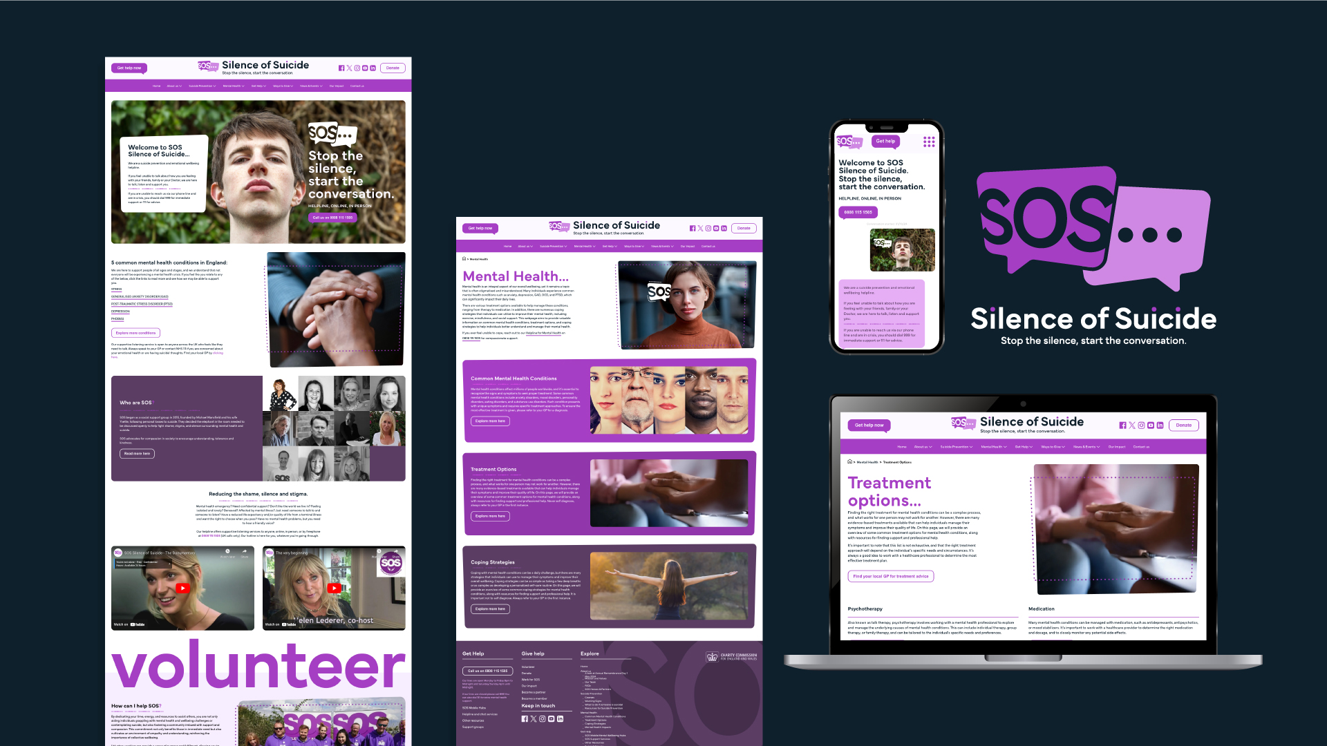
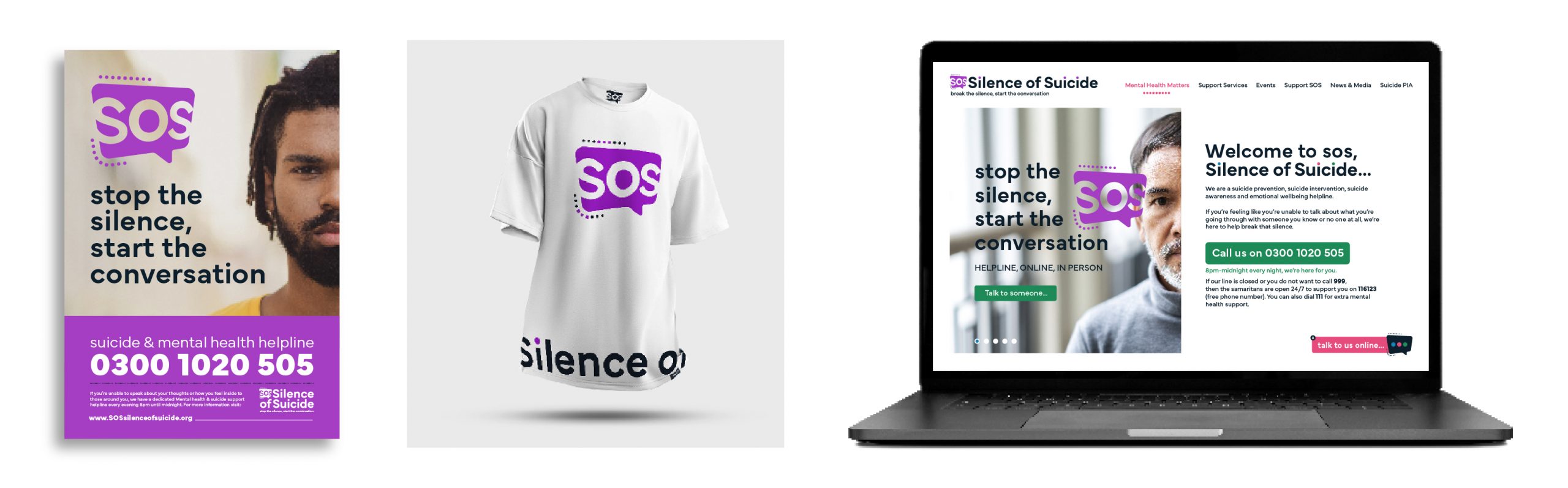
Coding the website
The result
This was a huge passion project for me, I thoroughly enjoyed every minute I got to spend on SOS Silence of Suicide.
After months of work and sessions with the owners and their employees and volunteers I feel like they’ve not got a good service that not only looks good, but works good and most importantly, it should do good and help those in need.
Fancy helping make this project better?
If you don't mind answering a few questions below I can improve the quality of this project for future users.