Awesome 😃!
Looking forward to chatting with you
Pause People
A new brand creation and ideation along with a website and collateral
Project Title:
Pause People rebrand
Industry:
Energy and Carbon
My Role:
Creative, Illustrator, User Interface, Web Developer.
Tools Used:
Figma, Adobe Illustrator, hand Illustration, Wordpress, Visual Studio Code

-
Discover
-
Develop
-
Deliver
DISCOVER
Initial brief
Gathering information
Pause People, originally known as Pause People Planet when we first met approached us with the opportunity to rebrand their business. It was a cobbled together brand that had no real style and very little branded assets or website.
What they wanted to achieve:
- A bright and colourful visual identity that would set them apart from their competitors in the market place
- A logo they could use across collateral
- A character they could add a personality too like ‘octopus energy’ or ‘bulb’
- A website they could edit themselves in the future
- A fun brand, nothing to corporate as this didn’t relfect who they were as business owners
DISCOVER
Interviewing the client
Discovering who they are
Now I knew what they wanted to achieve from working with me, I started asking them about their lives to discover what makes them tick, why they’re passionate about what they do and what made them unique.
I learned the following:
- They always looked at the big picture when it came to Carbon on the planet
- They believe in a holistic approach
- They were a human-centric company and believe in taking care of those around them as well as the planet
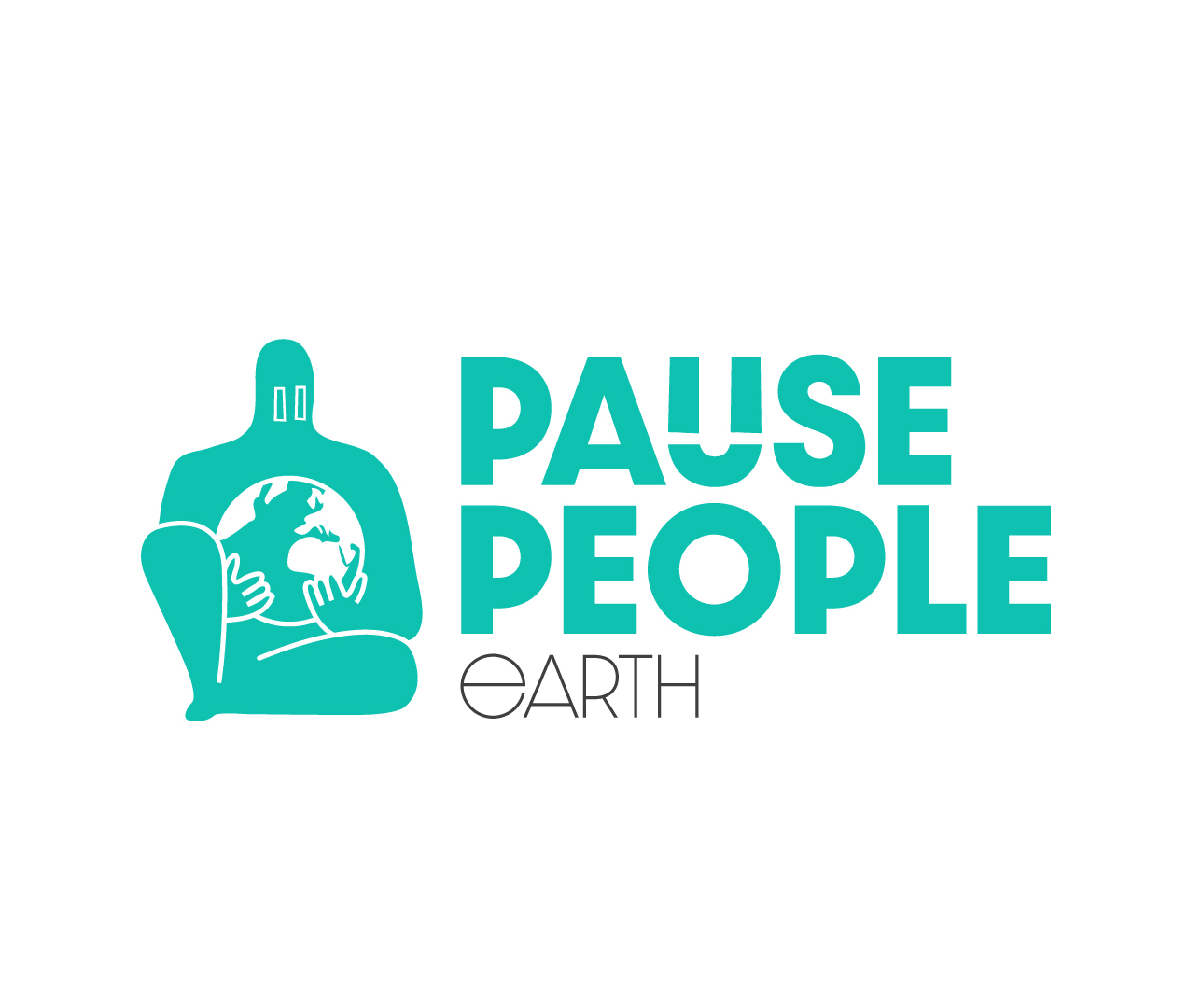
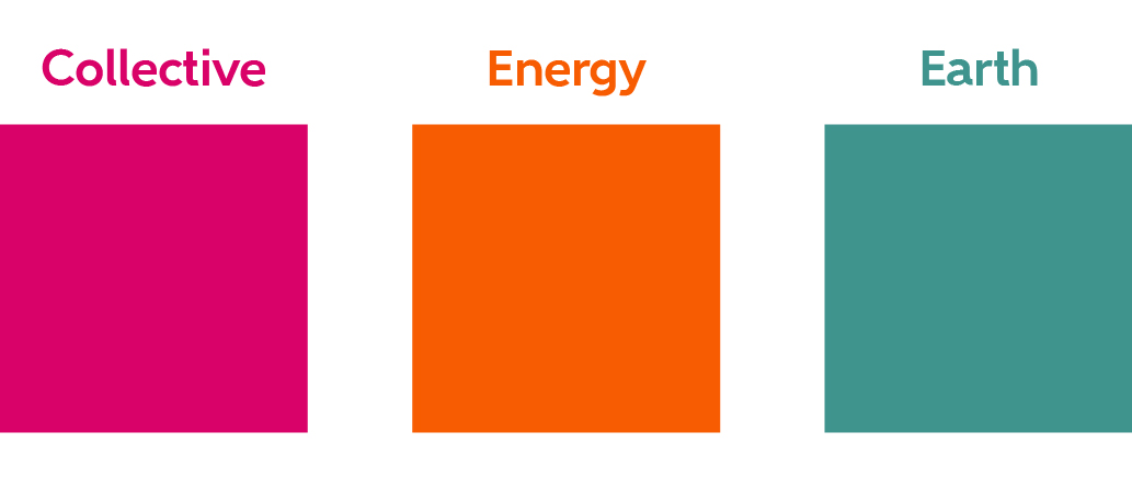
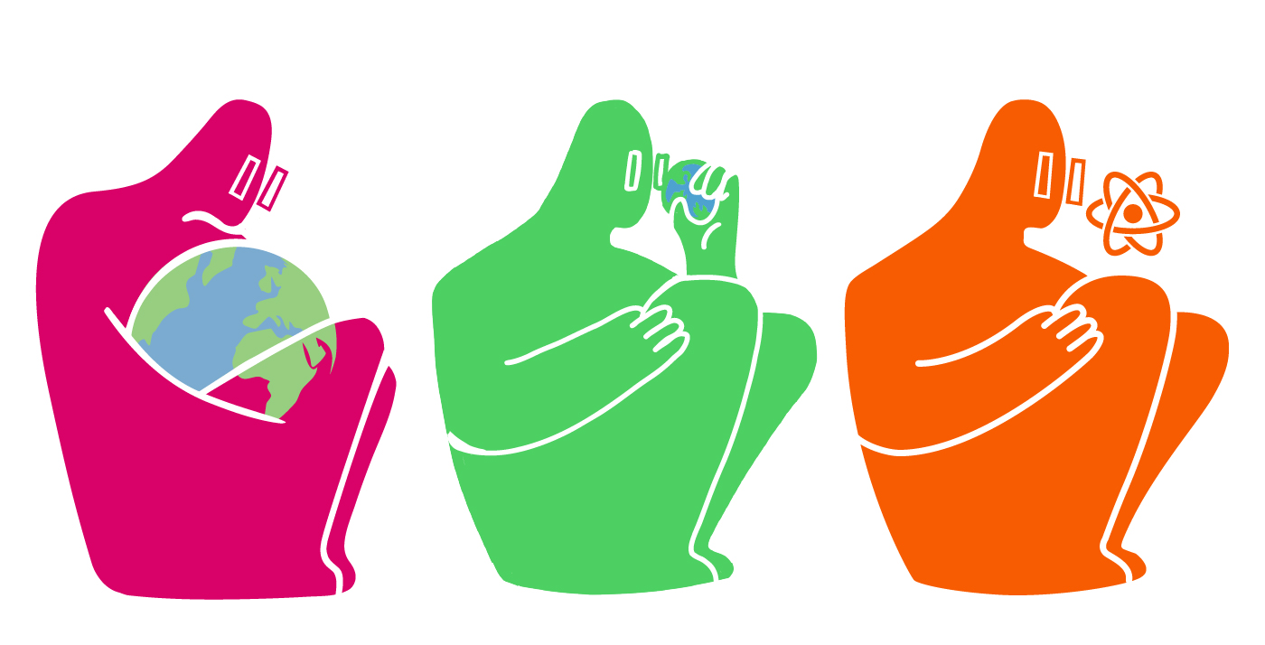
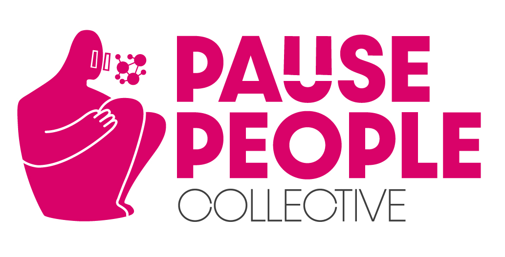
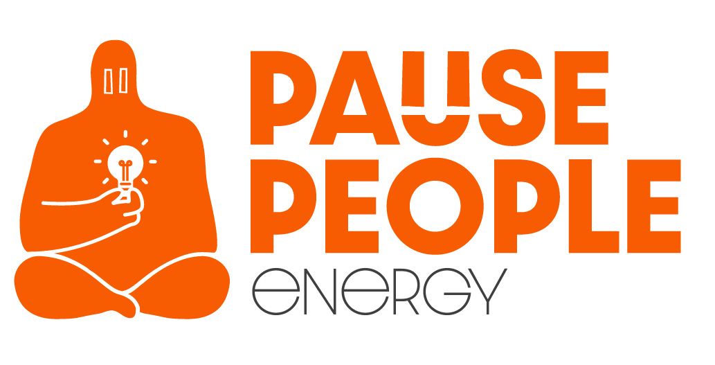
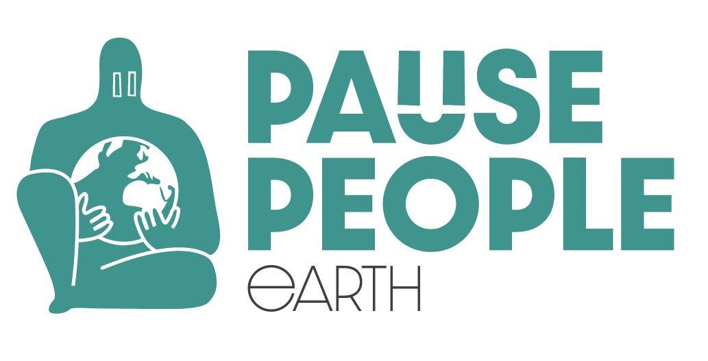
- They had 3 sub-brands, Collective: which covered the business links they can make between companies to help them with better energy prices or more energy effecient equipment. Energy: which covered gas and electric contracts they could secure to get them better rates and move them toward renewable providers and finally Earth: which covered the creation of carbon footprint calculation data so businesses can become net zero compliant and help them understand what’s generating the most carbon and where they have potential to cut back.
DEVELOP
Brand exploration
Coming up with the brand hook
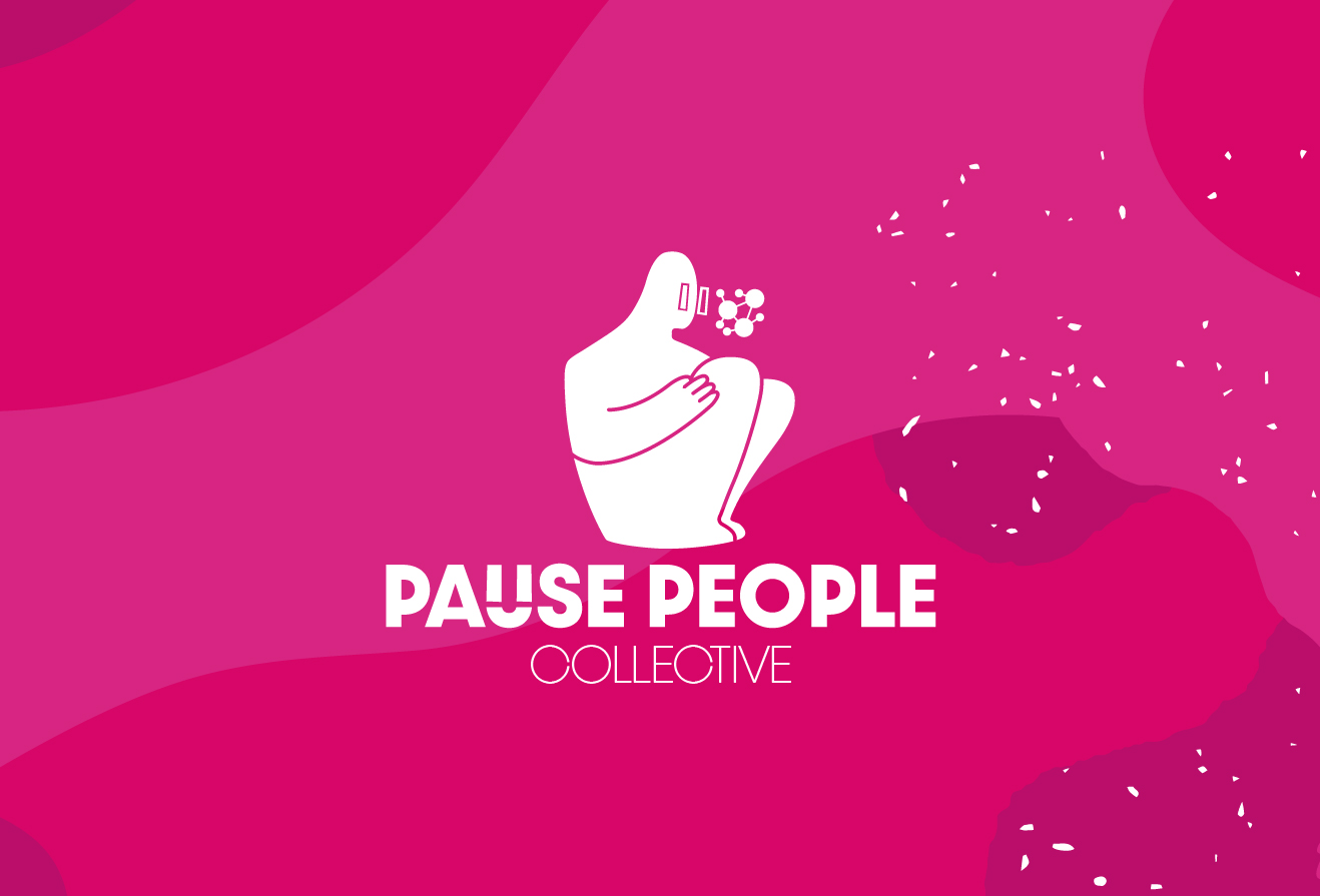
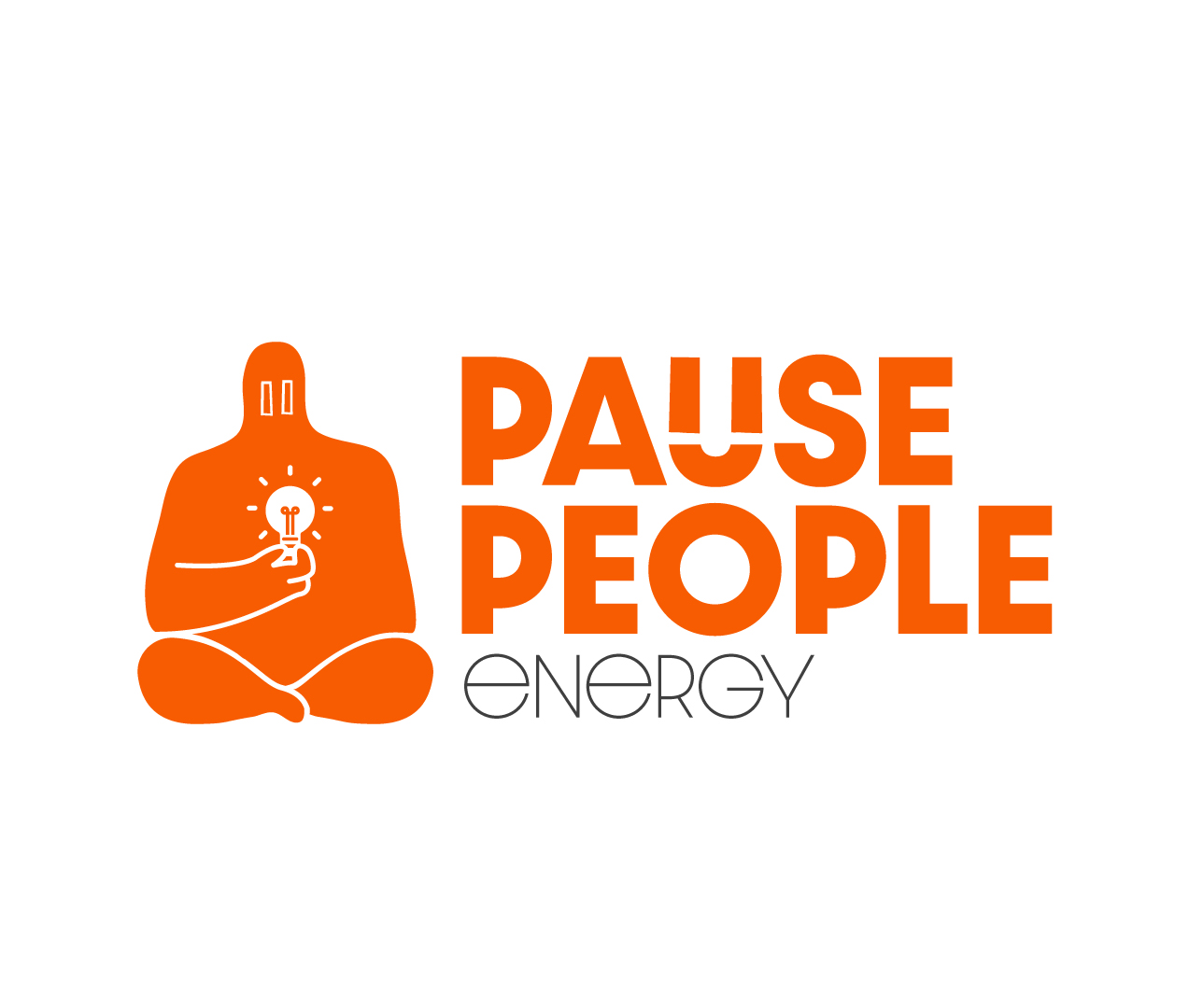
Pause People said they wanted a character to go along side their logo, which is something I love doing because I get to add a personality to something and it really helps the brand come together.
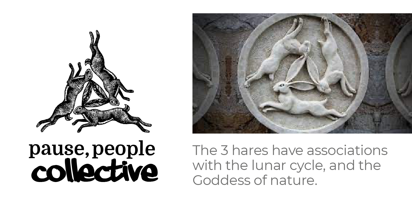
So I started thinking about what they said, they always think about the big picture, so what character or entity could look at the biggest of all pictures, a celestial being. With this in mind I started coming up with ideas about this ‘Pause Person’. A person who would take the time to ‘pause’ and look at the big picture.
I wanted the brand to be loose and flowing, almost like a water colour painting where I can add depth of scale by layering up different variations of the same colour.
I also needed the 3 brands to look visually different so I needed to choose 3 colours that would represent the theme of that sub brand.
DEVELOP
Ideas and thoughts
Brand development and ideas
First of all I needed to create some initial thoughts and ideas about what the brand could look like.
Shape, form and colour exploration:


Now I knew how it should look and feel I can think about the logo idea
They wanted a character or some illustration in the brand so I had a few thoughts.
So I looked at mythology and the world around me, what makes it tick or work.
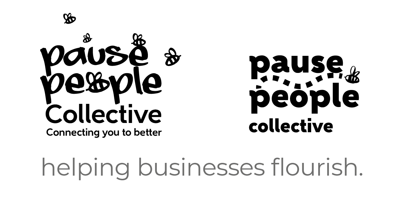
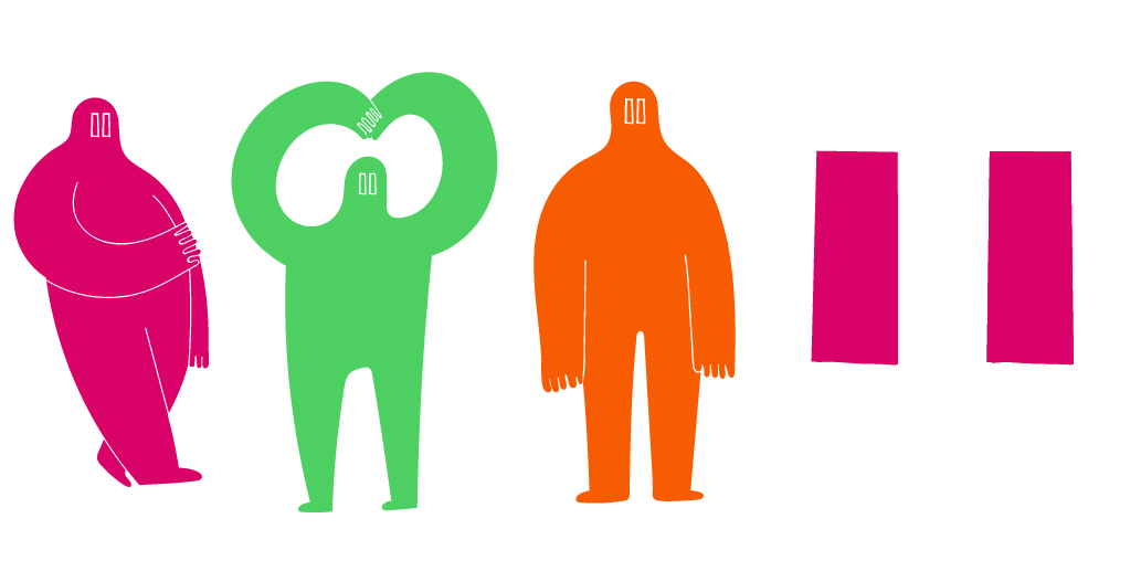
Eventually I settled on the idea of having an actual Person, as it is pause people after all. So I started developing a character style.
This person style was hitting the mark with the client
Pause People loved this idea of having a big celestial being looking big ideas and the planet, but they wanted 3 different illustrations for each of the sub brands. I also needed to create a type version of the logo too that went alongside these characters.
DELIVER
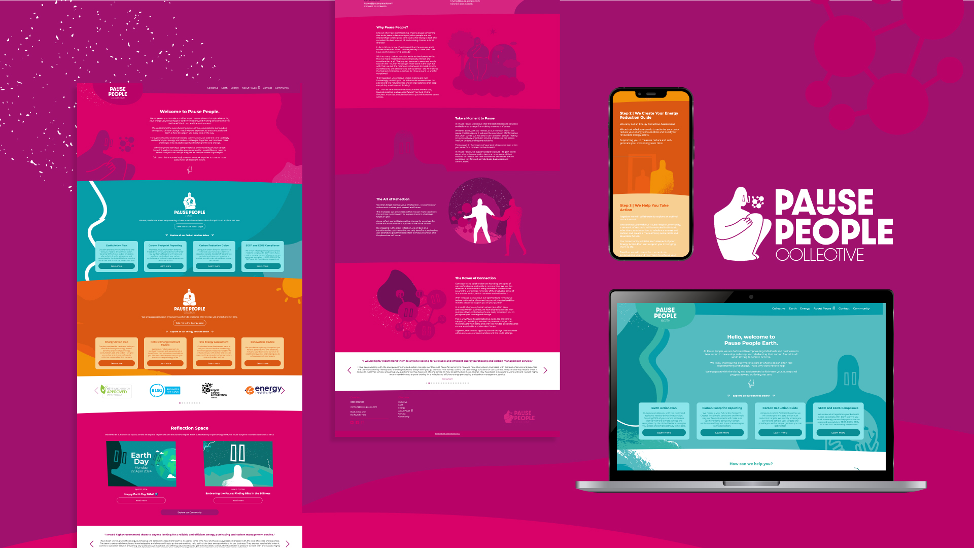
High fidelity visuals
Now I had my logos sorted, character style and general shape and form theme I could move on to designing the website for them.
DELIVER
Wordpress website
After the web visuals were signed off I began coding the website in wordpress, creating a completely bespoke theme with no plugins just hardcoded and editability added in using Advanced Custom Fields. The form also linked to their Salesforce account to help them manage enquiries.
DELIVER
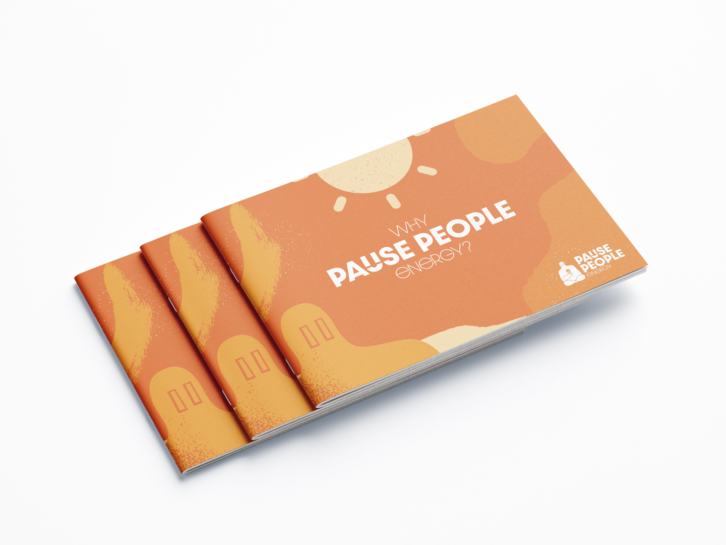
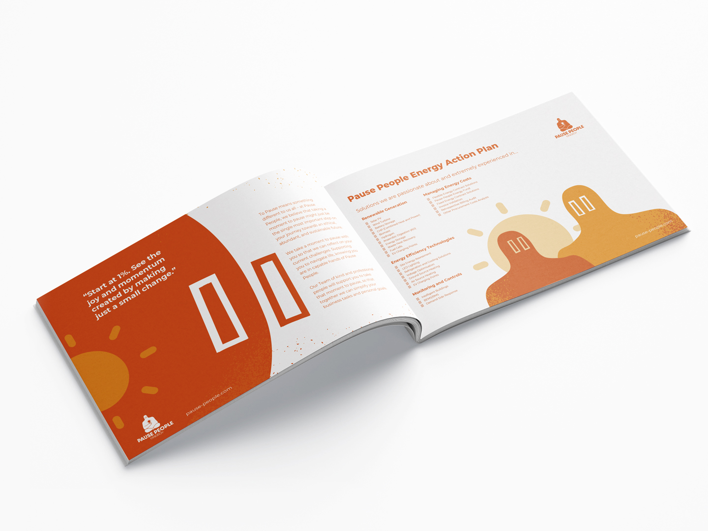
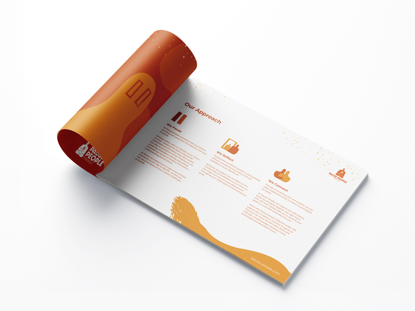
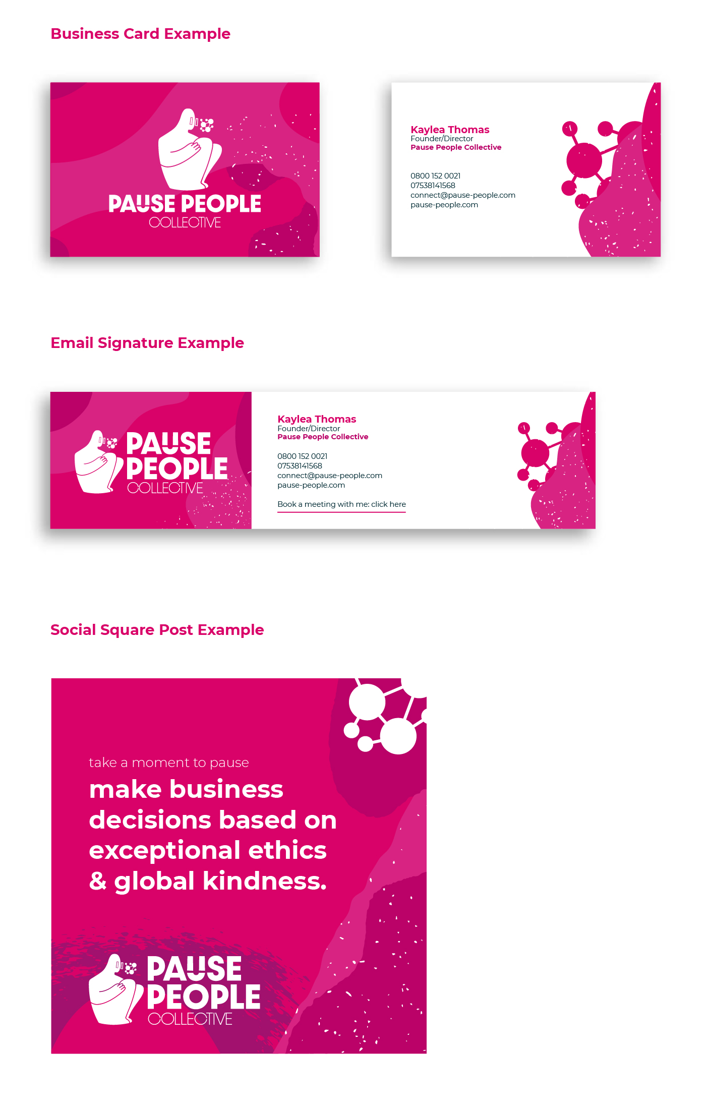
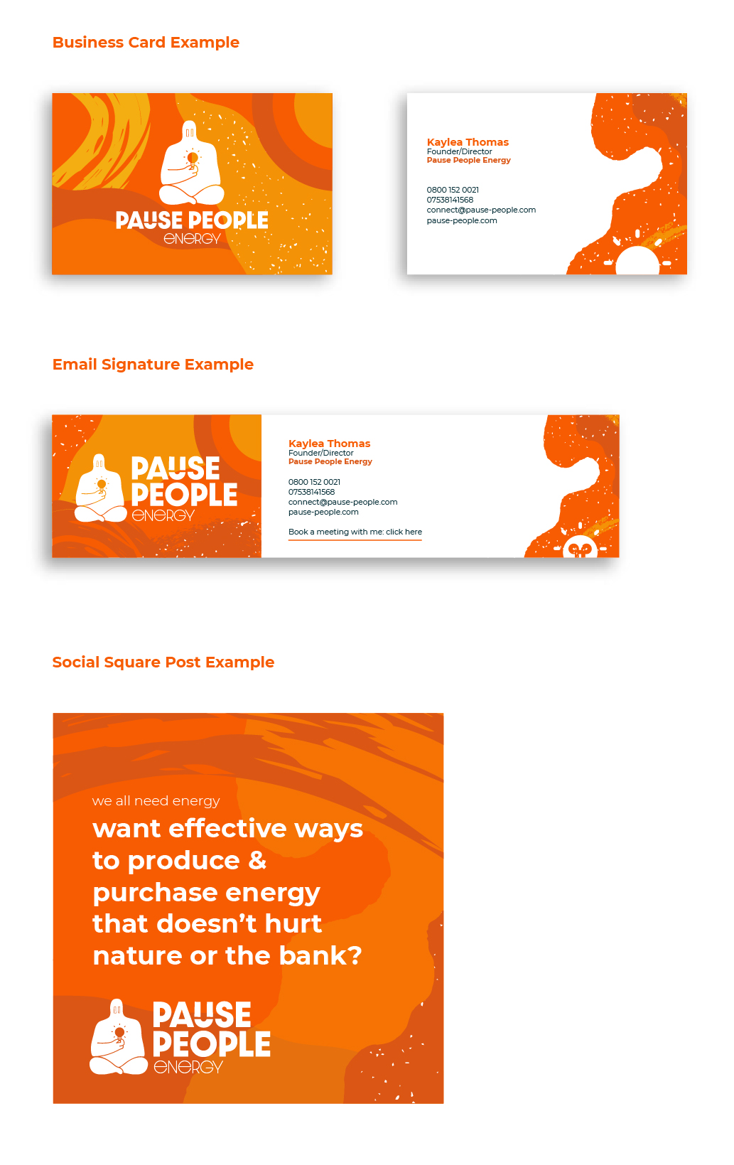
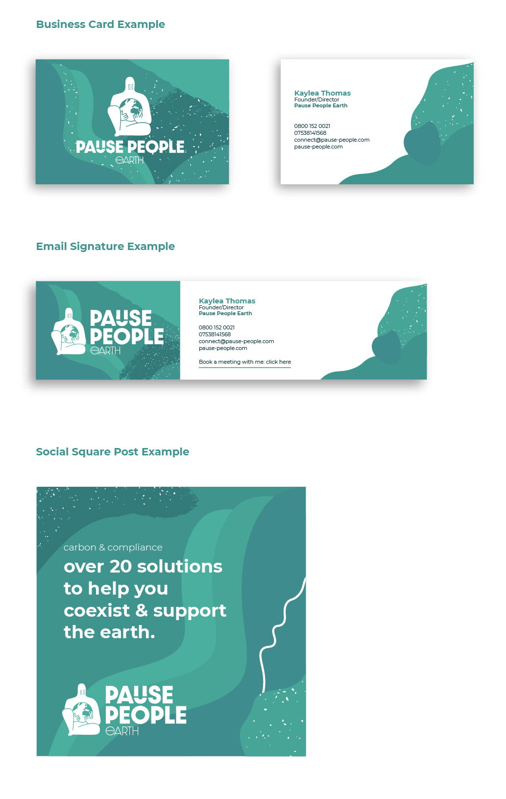
Collateral
After the website was coded and live I began work on the supporting collateral they needed for their business, including printed brochures, documents, social assets, email signatures and business cards.


Fancy helping make this project better?
If you don't mind answering a few questions below I can improve the quality of this project for future users.