Awesome 😃!
Looking forward to chatting with you

Institute of Hospitality
A website where the hospitality industry can learn more, interact with others and gain new work.
Project Title:
Member website redesign and rebuild.
Industry:
Hospitality Technology.
My Role:
User Experience, User Interface, Web Developer.
Tools Used:
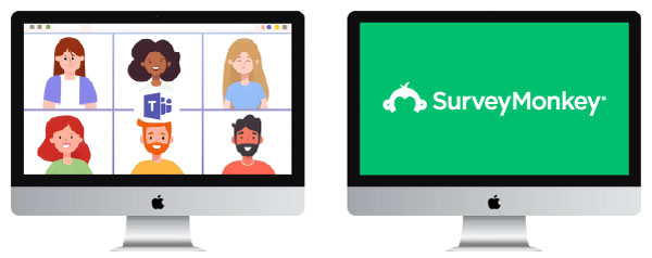
Miro, Figma, Survey Monkey, focus groups, Visual Studio Code, Postman, APIs

DISCOVER
Initial Problem
The Problem
IOH’s member based product website has become bloated and had no real user experience in mind, pages were mearly added on over time creating a huge warren of customer avenues and making it difficult for new users to find why they should sign up, what the benefits are and also how they can sign up and what the prices were.
They were finding it difficult to update the website as there were so many pages most of which were behind paywalls, so the page wasn’t worth showing.
DISCOVER
Immediate observations
At First Glance
After being made aware of the problem I looked at the website and tried to find my way around. I noticed that not only were there a lot of pages with paywalls there was no real direction to go in if you were looking into some specific. A lot of the pages had names which weren’t obvious what they were about, so there is alot of assumption on the end user to either a) know what that term means b) already visited the site before so they know where to look.
On each of the pages there was also very little cohesion between the elements on that page, they just seemed to either show everything they could or not keep a page specific about 1 thing at a time.
They were also giving away a lot of information for free, which isn’t what they’re intending to do. Afterall by having member’s sign up to get access to this information is how they keep their business going.
Logged out = sell the product features (don’t give the game away)
Logged in = offer up the features in a simple to navigate way
The Sitemap
Here’s a look at the current site map, listing out all the pages and their children pages.
DISCOVER
First-hand research into problem
Let’s talk to the people
There are a lot of members of staff at the IOH, these would be the best source of information I could use about the website as they deal with the users everyday and deal with the user complaints and issues when they arise. As this was an agency project I only had a set amount of time so wasn’t able to gather user details first hand, only the employee’s.
What they told me
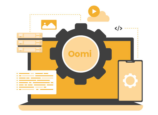
- They don’t use the website to handle the day-to-day interactions with the users data, they use an external CRM called ‘Oomi’
- When they update the website they don’t know how to add content so only logged in members can see it, so everyone just ends up seeing it
- They can’t access the users CPD data as it’s all stored on the website, not inside of Oomi
- They can’t create lists of people who have signed up to certain events as members, so they don’t know who’s coming and who should be there
- Some of the IOH employees use the website to display resources to gain new company memberships, but they have no way displaying company benefits
- The website has been hacked before so they’re worried about security of the website and users personal information
- They sell products on the website but they can’t see what products have been bought inside of Oomi
- The website looks really dated and ‘clunky’
DEFINE
Looking at the problem
What’s actually wrong with the sitemap?
It was time to look at what all the pages actually were and how we could group them together.
- A single page for every single topic on the top level navigation
- Overly wordy, massive amounts of information
- No way to quickly navigate large pages
- Difficult to find the reasons to join
Now I have a proper list of what each page is either a parent of child of I can look at what the user funnels are to become a member, or access resources.
DEFINE
Defining sitemap user funnels
How do users find what the IOH want them to
How many interactions does it take to get to what you want, and what is displayed across the sitemap.
There are almost 27 pages of content and almost 4 levels of interaction before you reach anything to do with actually becoming a member.
Takeaways
I then repeated the above process for every part of the IOH’s services in all category paths and found that this is a common theme throughout the site.
There is no real difference between logged out and logged in for users, the site looks the same and all the navigations links are the same.
DEFINE
Analysing what I've learned
What actually are the pain points?

- The sitemap doesn’t sell their product as a product, it just lists everything like a knowledge centre
- The website itself is difficult to update because of bought wordpress theme with little to no editability
- They don’t use the website to manage or access information they run the business off a CRM
- There is an inherit security risk of handling personal information on a framework like WordPress
- There needs to be clear logged in and logged out information
- The website doesn’t have any accessibility features built into it, thus limiting users who have those needs
- The look and feel of the website is very dated and looks more like a government site than company with a tech product
- They want it to feel more like a web application than a normal website
DEVELOP
Streamlining the sitemap
What should new users see?
New users should only be able to see a small snapshot of every element of the business, afterall this is a website dedicated to signing up members for a fee.
The current pages can be categorised better all the information should be clear and concise without the need to already know what certain subject titles mean.
Below is a sitemap where there are only 8 accessible pages for logged out users (new users) and each of these pages have a small summary of each of the services you could enjoy if you join the IOH. There is also a sitemap for the logged in pages where everything will now be run from a 1 central location, a dashboard style interface.
DEVELOP
Integrating their CRM
Use their CRM to run all data to and from, ditch wordpress as a CRM
After many lengthy talks with developers at their CRM – Oomi I was able to conclude that by adding in a secure password field input to their customer user data in their database I could then check whether a user email exists and if the password matches.
By doing this I could remove the need for WordPress to be the main source of membership handling, from now on it can all be done by Geting and Updating the information inside Oomi itself.
This also addresses the inherit security flaw that comes with WordPress, as if someone can gain access to the site by logging in their is always a chance this could be turned into a hack and sensitive information could exposed. Now the website will only handle text information about the IOH itself, never the users data.
I also suggested whitelisting any API’s calls to the server’s IP address, by doing this it means that even if someone gained access to the authentication tokens required to make an API call to Oomi they would be immediately refused. This method has now been put across other of their clients, so it turned out to be a good thing discovering this vulnerability WIN WIN.
DELIVER
Working on the new UI
Current User Interface Research
The current website is very plain and clearly looks like a WordPress theme that was never meant to handle such large amounts of complex information.
First I’ll look at what’s currently out there and what current trends are moving towards.
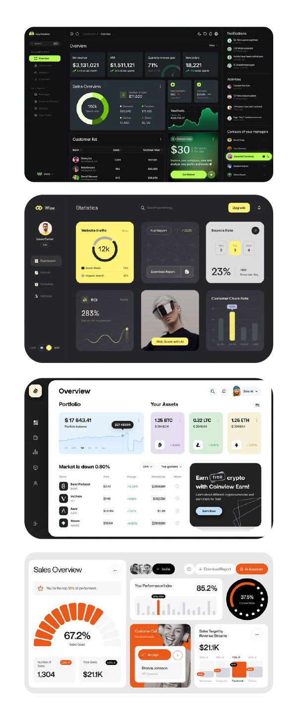
Key takeaways from inspiration
After taking inspiration from web applications for the user interface, which is something they wanted to align themselves with I then had touch points to design to.
- Rounded edges
- Even and equal spacing between ui elements
- Bright vibrant colours for user engagment
- Very informational in terms of stats
- Dashboard still approach to interacting with your personal user data
DELIVER
Wireframing & Prototyping
Core Structure
Now I can work on the how the user interface will work, so I’ll mock up what the site will look like and how they can move around the site through prototyping in figma so I can discuss this with the team at the IOH.
Below is a small sample of the wireframing process.
DELIVER
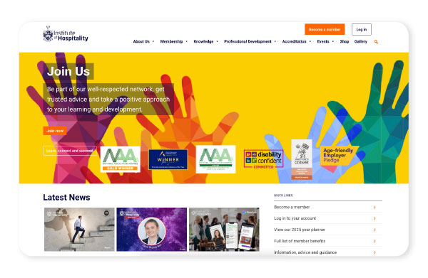
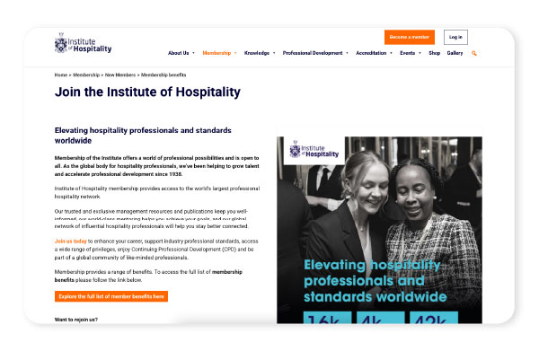
Finished UI
After working through the Wireframes and testing user flow with the IOH employees I then worked up the final visuals and developed the website.
This was a big project that took a lot of interaction with stakeholders, directors and managing directors. I loved getting into the detail of what they were selling and help refine and redirect their focus through a better user experience and refresh their brand’s visual theme.
Fancy helping make this project better?
If you don't mind answering a few questions below I can improve the quality of this project for future users.